The full story of
CAPSULE
Capsule is a satirical product line that critiques the growing trend of commercialised creativity workshops. The project treats creativity as something packaged and sold like a quick remedy. The name Capsule reflects how many modern art experiences are designed to be short, convenient and instantly gratifying rather than slow, exploratory processes. Through branding, packaging and catalogue design, the project mimics the language of self-help products and lifestyle fixes. By framing creativity as a consumable “dose,” Capsule exposes how creative expression is increasingly marketed as a quick escape for people seeking relief, stimulation or momentary transformation.

The Logo
The Capsule logo uses a hand-drawn, slightly uneven outline style to reflect the idea of creativity in its raw, imperfect state. Instead of a polished corporate mark, the sketch-like lettering feels closer to something drawn in a notebook or during a workshop. This visual choice reinforces the project’s critique of packaged creativity by referencing the act of making itself, while still feeling playful and approachable. The colour palette balances deep blues and purples with bright accent colours such as lime, pink, orange and yellow. The darker tones provide a stable base for the brand, while the vibrant colours mimic the energetic, overstimulating atmosphere often found in commercial art workshops. Together, the palette creates a playful yet slightly exaggerated visual language that mirrors the project’s satirical take on creativity being marketed as a quick, feel-good experience.


The Products
The Capsule product line consists of 18 items designed to reflect and critique the way creativity is packaged and sold in commercial art spaces. The products draw inspiration from the types of materials commonly found in workshops, beginning with familiar stationery such as sketchbooks, markers and simple craft tools. As the range progresses, these ordinary items gradually evolve into more exaggerated and satirical products that highlight how creativity is increasingly framed as something quick, guided and outcome-driven. Many of the products mimic the language of self-improvement, wellness and productivity, presenting creativity as something that can be consumed in small, convenient doses. Through playful packaging, ironic instructions and overpromised benefits, the items question the narratives these spaces promote, such as instant transformation, effortless creativity and guaranteed results. By designing the products as if they belong to a real brand, the project exposes the business logic behind these experiences and reveals how creativity is often reduced to a marketable service rather than an open-ended process.

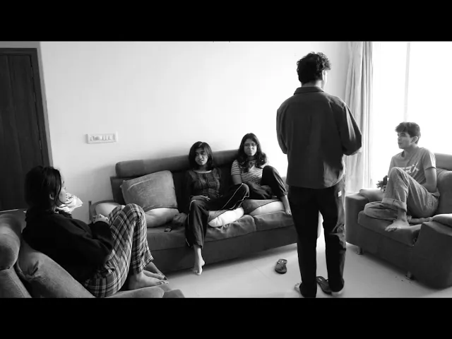
The Commercial
The commercial presents Capsule through the style of exaggerated product advertisements that promise quick, life-changing results. By mimicking this familiar advertising format, the video highlights how creativity is often marketed as an instant fix. The parody amplifies these promises to expose the unrealistic expectations many commercial art experiences promote.
The Exhibition
The project was exhibited as part of my pre-thesis at Venkatappa Art Gallery with Srishti Manipal. To extend the satire, I created a shop-like display that presented Capsule as a real retail experience. The products, catalogue and visuals were arranged like a commercial store, reinforcing the critique by making the fictional brand feel convincingly real.


Dive Deeper
Alongside the exhibition, I documented the project in a book that traces its development from research to final output. The book brings together primary and secondary research, insights from masterclasses at Srishti Manipal, and the iterative design process, explaining the decisions, experiments and refinements that shaped Capsule into its final form.